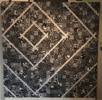
I've often said, the simpler the basic quilt design is....the more difficult it is for me to create a successful piece. This one was a hair puller for sure.
If you saw the last post......my idea was to highlight the black and white fabric with red. Unfortunately, the reds I had in my stash simply weren't right.....too bright, too pink, too dull. Sale-ability is also a factor.....in your face designs are what I prefer, but that's not necessarily the case for shoppers who wish to own a piece they can live with daily....and NOT tire of it.


5 comments:
Hope it sells! So disappointed that your reds could not come up to the proper standards! You just can never depend on them. Now turquoise, on the other hand, is very dependable, but definitely not for this quilt.(Grin!) You chose wisely when thinking of your customers!
It is a wonderful piece, I hope the quilting goes well!
I like the simplicity of the black and white. And now to quilt....
I'm taking my time quilting this piece since my shoulder is back to being quite sore. Had an appointment with ortho. doc but obviously that has been postponed.....so I'll just pace myself....hard for a type A personality!
It is lovely!!! Hope you do get someone to 'take it home'..but I'd prefer the red! Just me!!
Post a Comment